It bums me out that the Ontario flag is so bad. It would take like 10 minutes to throw the trillium on the same background as the national flag and have something unique and with less monarchy ick. The current logo is a bit corporate but it would be fine.
https://i.pinimg.com/736x/4c/39/d4/4c39d441f2ff5aec306d9ce7494f2da4--ontario-norman.jpg
This. Maybe not ideal, but way better than the crest and jack thrown on. I’s like to see the colours be from Ontario’s tartan.
It should be the franco-ontarian flag, with the trillium and the Fleur de Lys.
Please don’t normalize putting logos on flags
Steel manning here, I think they didn’t mean literally put a corporate logo on the flag. The trillium is the flower of Ontario, and can be simply drawn similar to the maple leaf.
Wow, British Columbia’s flag is hideous! It’s like they couldn’t make up their mind.
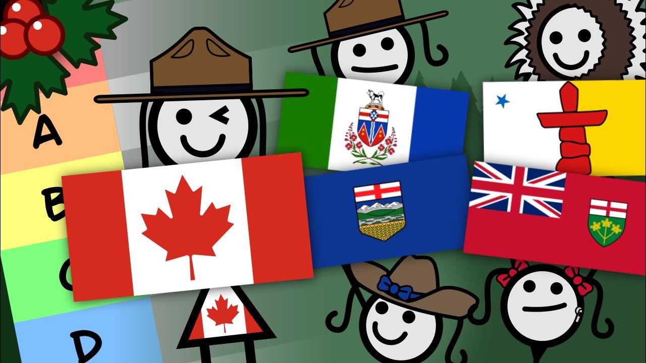
Tier Flags S Canada, Québec A New Brunswick, British Columbia B Nunavut, Nova Scotia, Newfoundland and Labrador, Newfoundland (unofficial) C Saskatchewan, Yukon, Northwest Territories D Prince Edward Island, Alberta F Ontario, Manitoba He seems to have slightly different standards when it came to giving the complex designs A-tier but maybe he was just tired of all the US state seals. Saskatchewan deserves slightly better imo (but this could be said about anything in that province).
The Manitoba character’s disappointment for not doing better with their flag vs. Ontario’s giving no fucks is comedy gold. They get freezies in the end so all good.
Les Quebecois if CGP-Grey rated their flag any lower than S-tier:

I was surprised to see the NB ranking but I guess given some of the alternatives.


