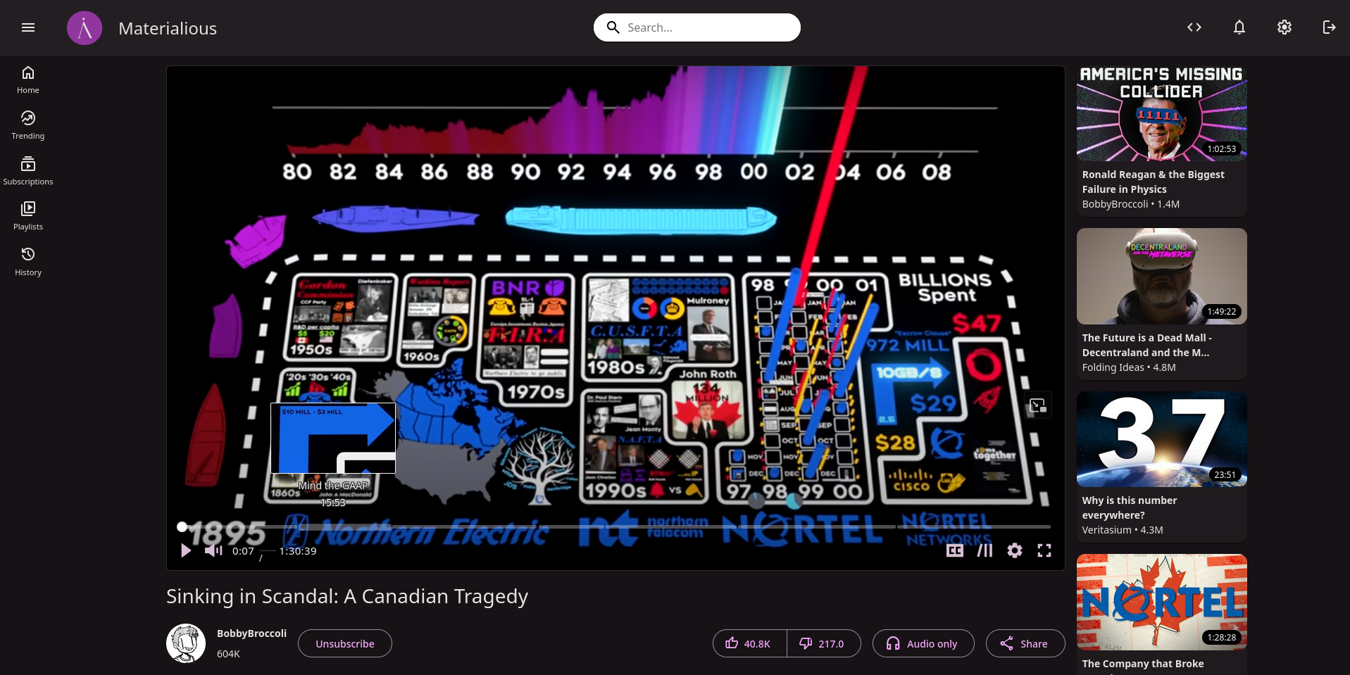
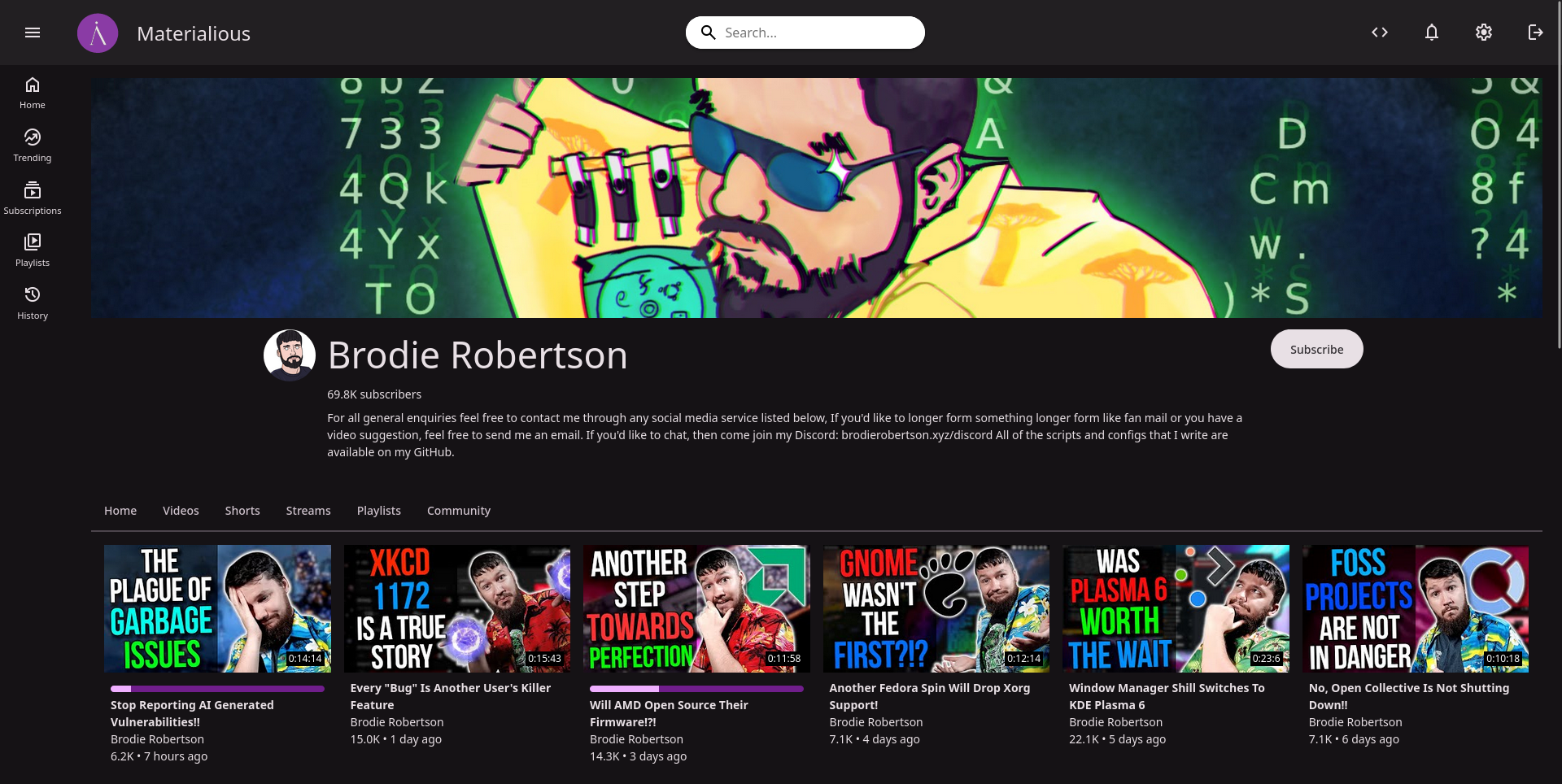
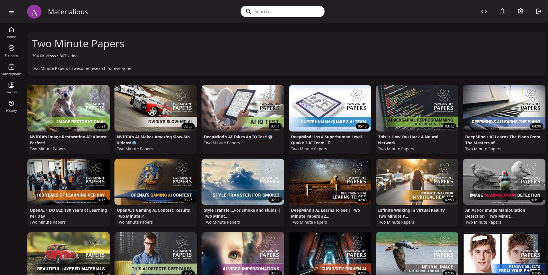
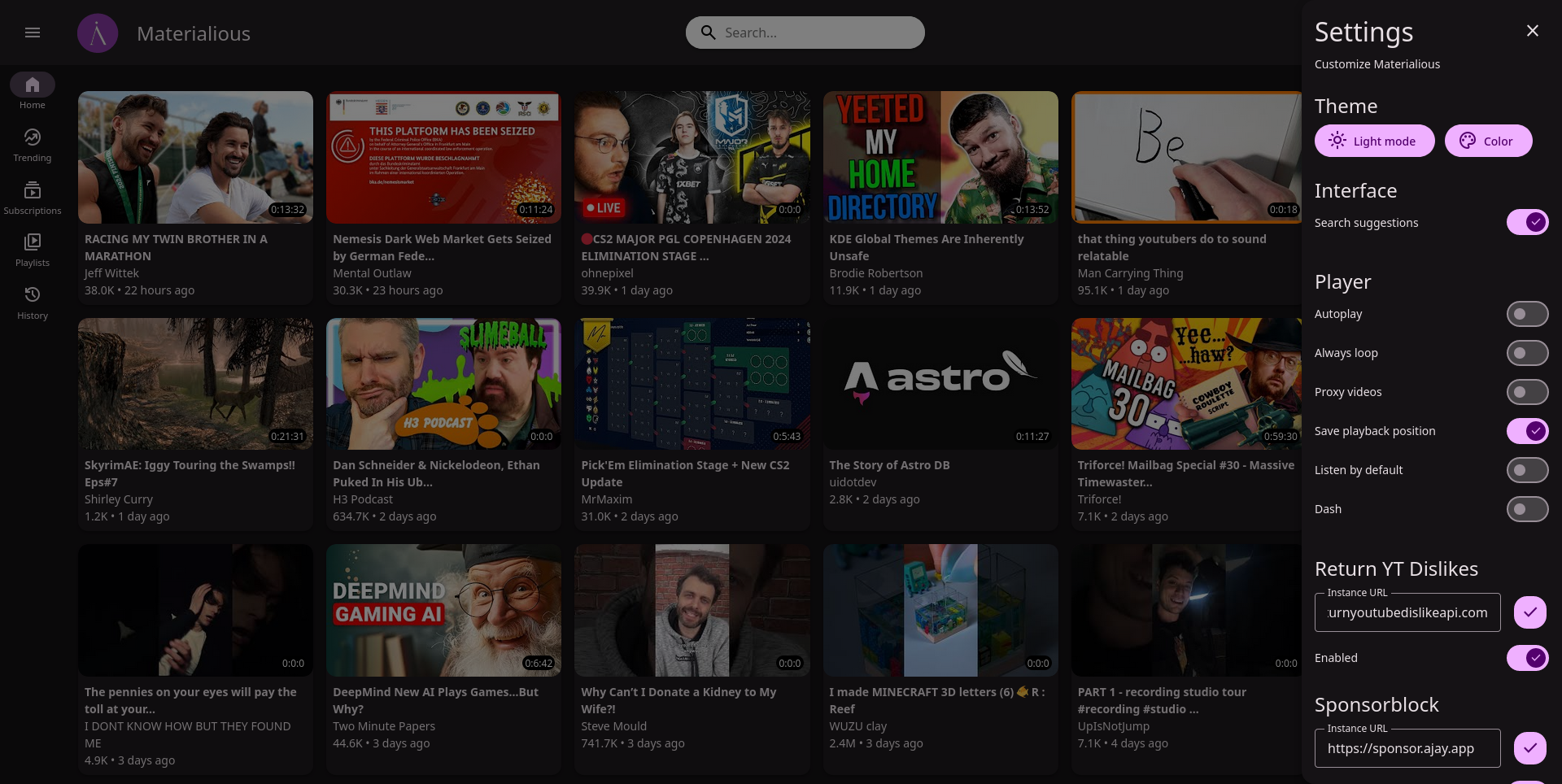
For the last month I’ve been working on a modern, material you interface for Invidious.
Github (Leave a star if you want)
Features
- Sponsorblock built-in.
- Return YouTube dislikes built-in.
- Video progress tracking & resuming.
- No ads.
- No tracking.
- Light/Dark themes.
- Custom colour themes.
- Integrates with Invidious subscriptions, watch history & more.
- Live stream support.
- Dash support.
- Chapters.
- Audio only mode.
- Playlists.
- PWA support.
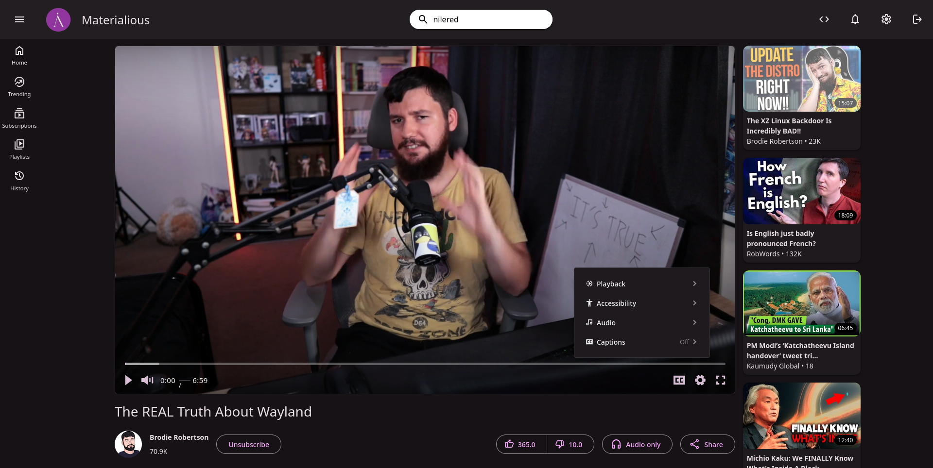
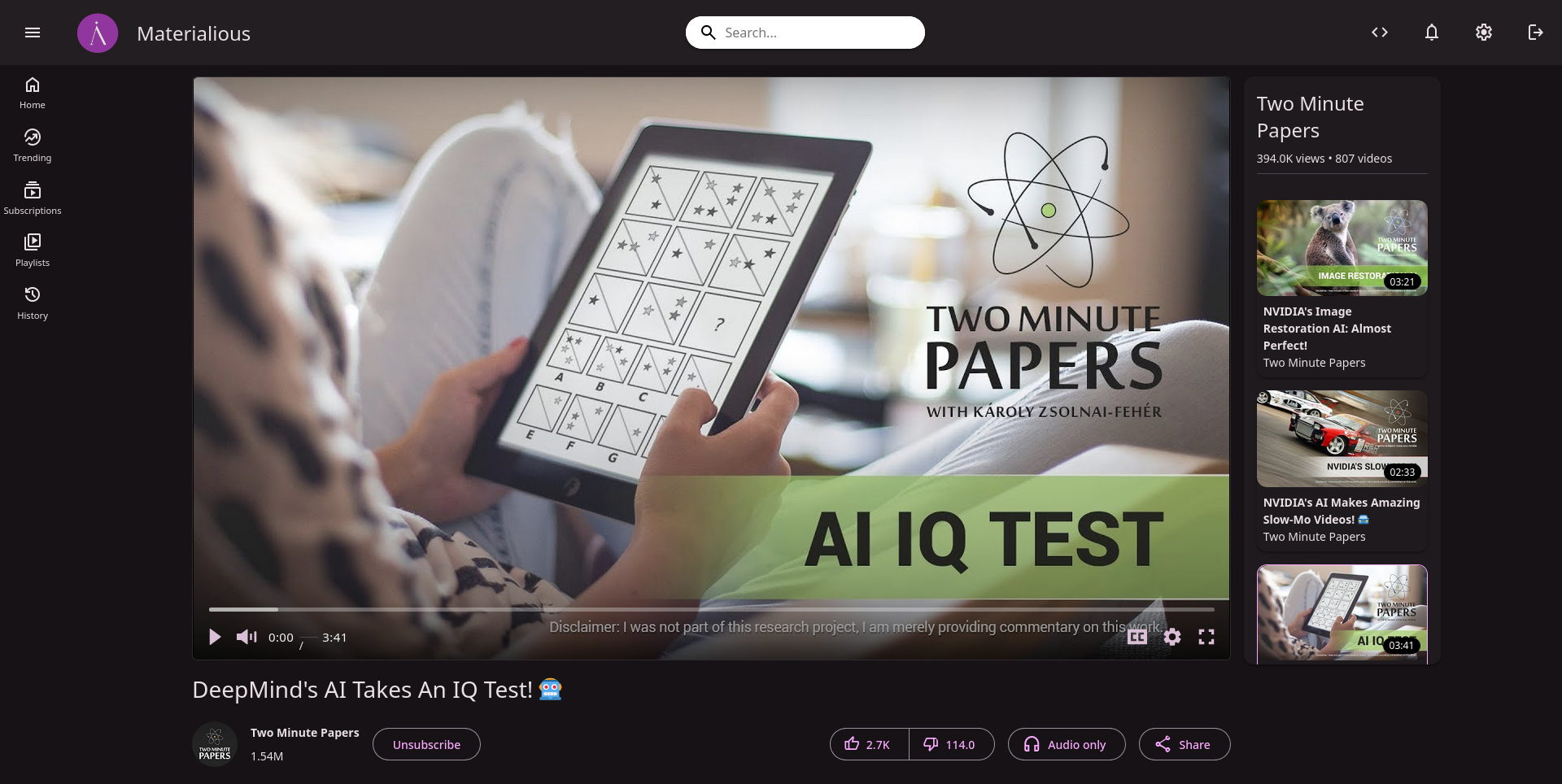


I don’t use invidious much, but this seems easy to use and friendly! Much better than the default from a new user perspective. My only complaint is please use a dropdown or radio select for the quality instead of a slider, using the slider input makes me feel dirty.
Yea the slider was the default component vidstack uses, I do agree it would be a good idea to use a drop down instead.
It also doesnt seem to remember the selection, every video i need to bump it back up off 340p